A storm made from straight lines
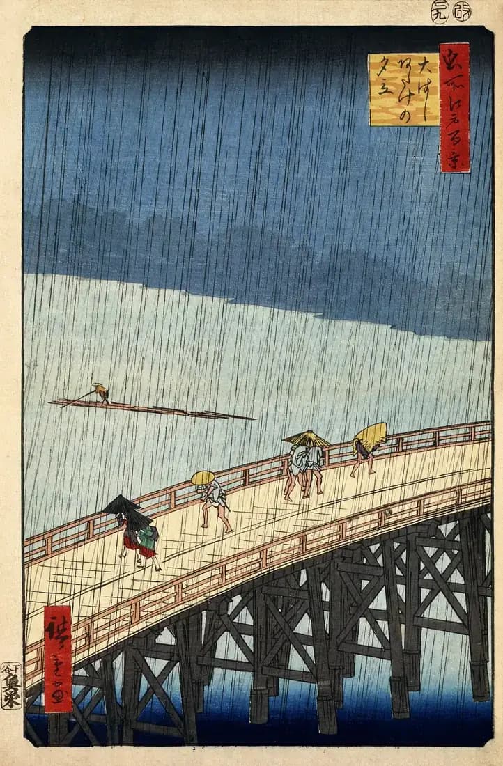
The sky has opened, but Hiroshige does not paint a soft curtain of weather. He throws two fields of hard diagonal lines across the print. Their opposing angles make the downpour feel unstable, while the dark band above the horizon suggests that the storm has swallowed the far bank of the Sumida River.
Printing such thin, closely spaced rain was demanding. The lines had to remain clear through carving, inking and pressure. They cross bridge, water, people and sky without flattening the image because their rhythm changes against every surface beneath them.
Everyone reacts differently
On Shin-Ōhashi, travellers lean into the storm. One person has an umbrella; others cover themselves with hats or a straw cape and hurry toward shelter. Below, a boatman keeps working. On the distant water, a long timber raft is reduced to a few dark horizontal strokes.
The bridge enters from the lower left and leaves through the right edge, so we never see either bank. Hiroshige makes us feel caught on the crossing too. Atake, the district named in the title, appears across the river rather than as a detailed destination.
Hiroshige’s rain reaches Van Gogh
Thirty years later, Vincent van Gogh translated this print into oil paint. His Bridge in the Rain keeps Hiroshige’s bridge, figures and rain but intensifies the colour and adds a decorative border filled with Japanese characters borrowed from other prints.
The copy makes the original technique easier to appreciate. Van Gogh could draw his rain directly with a fine brush. Hiroshige’s team had created the same sensation through a reproducible woodblock process, turning a fleeting shower into one of the most recognisable images of Edo.
Sources and further reading
- The Metropolitan Museum of ArtPrint details, series context and the demanding rain-line technique.
- Library of CongressDigitised original print, dimensions, title and rights information.
- Van Gogh Museum, Bridge in the RainVan Gogh’s 1887 painted response to Hiroshige.